
n an age dominated by Instagram grids, NFT marketplaces, and TikTok art challenges, the physical business card should, by all logical predictions, be dead. Yet, for professional artists, it is more alive—and more critical—than ever. Why? Because art is a tactile, visual, and emotional experience. A LinkedIn request or a “Link in Bio” cannot replicate the weight of high-quality paper or the texture of a letterpress.
Your portfolio gets you the interview. Your website validates your talent. But your artist business card gets you the commission.
In the gallery circuit, at craft fairs, or even during a chance encounter with an interior designer at a coffee shop, the business card is the only physical ambassador for your brand that you leave behind. It is a $10,000 rectangle—small, portable, and potentially lucrative. This guide will walk you through designing a card that doesn’t just inform, but intrigues.
Why Generic Templates Fail the Visual Artist
Most business card templates are designed for lawyers, realtors, or plumbers. They prioritize information hierarchy (Name > Title > Phone > Email) over aesthetics. For an artist, this is a fatal flaw. You are selling vision, not plumbing services.
When you hand a gallery owner a flimsy, double-sided glossy card from a big-box office supply store, you communicate one thing: I do not pay attention to detail. Your card is a micro-portfolio. If you cannot design a 3.5 x 2-inch masterpiece, why should a collector trust you with a 4-foot canvas?
The shift from “contact card” to “miniature artwork” is the single most important pivot you can make in your marketing strategy.
Essential Components of a High-Conversion Art Card
Before we discuss paper stock or typography, we must address the anatomy of the card. A beautiful card that lacks utility is just a coaster. You need a balance of form and function.
1. The Visual Front (The Hook)
This is your 0.5 seconds of fame. Do not clutter this with your address or phone number. Use the front of the card exclusively for:
-
A high-resolution thumbnail of your best-selling or most iconic piece.
-
A texture or pattern representative of your style (watercolor wash, charcoal grain, digital glitch).
-
Your logo or signature (hand-drawn is better than typed).
2. The Information Back (The Bridge)
The reverse side is where the “boring” stuff lives, but it must be scannable. Include:
-
Your Name: As you want to be known (e.g., “J. M. Kline” or “Sofia “).
-
Medium/Specialty: (e.g., “Oil Painter, Murals & Pet Portraits”). SEO tip for humans: Tell them what you do immediately.
-
QR Code: A dynamic QR code that leads directly to your portfolio (not your homepage). Pro tip: Use a custom QR code that matches your color palette.
-
Social Handle: Only the platform you are most active on (one is enough; three is noise).
-
Email: Still the king of commission inquiries.
3. The Call to Action (CTA)
Most artists forget this. Add a tiny line of text: “Custom commissions accepted” or “Studio visits by appointment.” This triggers the recipient to act, rather than just file the card away.
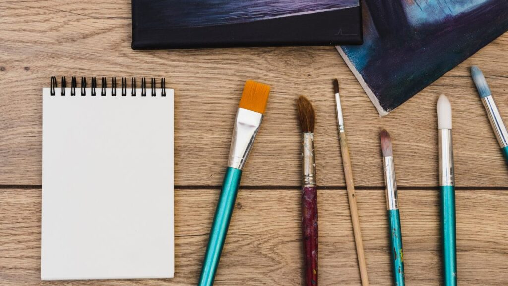
Material Science: Choosing Your Weapon
The “standard” 16pt card stock with a glossy UV coating is the enemy of originality. Artists have the unique advantage of being able to use materials that feel like their medium. Here is how to match material to your genre:
-
For Watercolorists & Illustrators: Use uncoated, soft-touch paper (like Mohawk Superfine). It absorbs light, mimics cold-press paper, and feels expensive in the hand. Avoid gloss at all costs.
-
For Digital & Graphic Artists: Go for spot UV or foil stamping. A matte black card with a holographic foil line looks futuristic and sharp. It says “precision.”
-
For Sculptors & Ceramicists: Recycled Kraft paper or thick cotton rag paper (100% cotton). The organic, raw edge texture conveys earthiness and handmade quality.
-
For Photographers: Lustre or Metallic paper. The slight shimmer adds depth to your image without the glare of gloss.
The “Texture Trap”: Very textured paper (linen, felt) looks beautiful but is impossible to write on. A gallery director needs to scribble notes on the back of your card. Leave a smooth spot for a pen.
The Psychology of Size and Shape
While the standard 3.5″ x 2″ fits neatly into a wallet, it also gets lost in a stack of 50 other standard cards. To stand out, consider the gestalt of your shape.
-
The Square Card (2.5″ x 2.5″): Modern, balanced, and perfect for Instagram-style photography. Warning: Expensive postage if mailed, and won’t fit in a Rolodex (who uses those anymore?).
-
The Slim Card (3.5″ x 1″): Ultra-modern. Great for minimalists and line artists. It looks like a bookmark.
-
The Folded Card (4″ x 2.5″ folded): Essentially a mini brochure. The inside can show 3 small images. Ideal for mixed-media artists.
SEO Search Intent: When artists search for “unique business card sizes,” they are often trying to solve the “lost in the stack” problem. A non-standard shape solves this, but ensure it still fits in a standard wallet slot.
Typography: Your Voice on the Page
You are a visual artist, which means you have opinions about fonts. However, legibility must win over artistry on the contact side of the card.
-
Do not use script fonts for your phone number. A curly “8” looks like a “6.” A cursive “4” looks like a “9.” Save script for your name only.
-
Hierarchy is king. Your Name (24pt) > Your Service (10pt) > Contact info (7pt).
-
White space is not wasted space. Cramming your email, website, Etsy, Patreon, TikTok, and Instagram onto one side makes you look desperate. Pick two social channels. Master them.
Digital Integration: The QR Renaissance
QR codes are no longer a pandemic-era gimmick; they are an expectation. But a black-and-white QR code slapped on a beautiful painting is jarring.
How to optimize your QR code:
-
Customize the color: Use a tool like QR.io or Canva to change the dots to your brand color (e.g., burnt sienna or ultramarine).
-
Add a logo: Put a tiny version of your signature or logo in the center of the code.
-
Track the scan: Use a dynamic QR code that tracks where people are scanning (e.g., “Booth 14 at Art Basel” vs. “Local Coffee Shop”). This data tells you where your marketing is working.
-
Destination matters: Never send a QR code to your homepage. Send it to a landing page that says “You scanned my card! Click here to see the collection I mentioned.”
Case Study: The Gallery Rejection Turned Commission
I recently consulted a pastel portrait artist, “Elena,” who was struggling to break into high-end pet portrait commissions. Her old card was a glossy VistaPrint template with a clip-art dog and her Gmail address. She was handing out 500 cards a year with zero return.
We redesigned based on SEO and psychology principles:
-
Material: Velvet laminate (soft to touch, like fur).
-
Front: A macro shot of a dog’s eye she had painted (intense eye contact drives engagement).
-
Back: A simple QR code linking to a “Pastel Process” video on YouTube.
-
CTA: “Capture their soul. No deadlines.”
Within three months, a gallery owner who had rejected her previously found the card in his wallet. He scanned the QR code, watched the video, and realized her process was the selling point. He didn’t need her art; he needed her to teach a workshop. She now runs quarterly workshops at that gallery. The card cost $35 to print.
Common Mistakes That Scream “Amateur”
Avoid these pitfalls to ensure your card elevates your brand rather than diminishes it:
-
The “All-in-One” Disaster: Using your home address. Unless you run a public studio, use a PO Box or your neighborhood (e.g., “Brooklyn, NY”). Privacy is safety.
-
The Dead Link: Your portfolio website must be mobile-optimized. If the QR code takes me to a Flash-based site from 2010, I will throw the card away.
-
No Social Proof: If you have space, a single line like “As featured in Juxtapoz Magazine” or *”Sold 500+ originals worldwide”* builds instant authority.
-
Using the Card as a Coupon: Don’t put a “20% off” on your permanent business card. It devalues your work. Save discounts for flyers.
The Green Artist: Eco-Friendly Options
Sustainability sells. Millennial and Gen Z collectors specifically seek out artists who align with their values. You can be “green” without sacrificing quality.
-
Seed Paper: Paper embedded with wildflower seeds. The recipient plants the card to grow flowers. Best for: Nature photographers and botanical illustrators.
-
Stone Paper: Made from crushed limestone and non-toxic resin. It is waterproof, tear-resistant, and requires no trees or water to produce.
-
Recycled Denim/Cotton: Cards that look like jeans or old t-shirts. Incredible texture.
SEO Keyword Note: “Eco-friendly artist business cards” has a low competition but high conversion rate. If you use these, mention it explicitly on the card (“Printed on 100% post-consumer waste”).
Where to Print vs. Where to DIY
You can design the card yourself using Adobe Express, Canva, or Procreate. However, you should never print them at home. Home printers cannot handle the registration (cutting accuracy) or the weight of professional card stock.
Recommended printing tiers:
-
Budget ($20 – $50): Moo (excellent for artists due to “Printfinity” – printing different images on every card). Vistra (good for standard cuts).
-
Mid-Range ($100 – $200): GotPrint or Primoprint (for foil stamping and thick cotton stocks).
-
Luxury ($300+): A local letterpress shop. If you are selling $5,000 paintings, your card should cost $2.00 per unit.
The Final Checklist: Before You Hit Print
Before you upload your PDF, run through this final SEO-friendly checklist to ensure the “user experience” (the gallerist holding your card) is flawless:
-
Is the font size for the phone number at least 8pt?
-
Does the QR code go to a live, mobile-friendly portfolio?
-
Have you proofread the email address 3 times? (E.g.,
artist.name@domain.comvsartis.name@domian.com). -
Is your Instagram handle consistent with your URL?
-
Does the material reflect the texture of your art?
Conclusion: Your Card is a Promise
artist business card is not merely a repository of contact information; it is a promise of quality. It is the first physical interaction a collector has with your brand. If it feels cheap, your art feels cheap. If it is thoughtful, your art is perceived as valuable.
In the noisy digital world, the tactile silence of a beautiful card is a competitive advantage. Do not rush it. Treat your business card as the smallest canvas you will ever paint—and paint it like your career depends on it, because it does.
Stop scrolling. Open your design software. And go make something they cannot throw away.